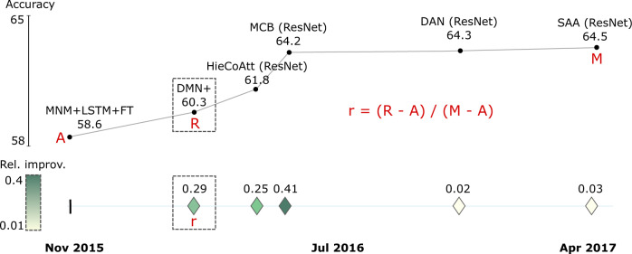
Fig. 5. Example of calculating the relative improvement in SOTA for the ‘VQA v1 test-dev’ benchmark.
Top: The SOTA curve displays accuracy results achieved by different models over time. Bottom: The values of the SOTA curve rendered as relative improvement r, calculated as the ratio of the obtained result (R) minus the previous result over the difference between the final (M, maximum) and first (A, anchor) accuracy values. The first result (A) is displayed as a vertical dash in the trajectory, whereas the remaining SOTA jumps are depicted as icons with color corresponding to relative improvement.

