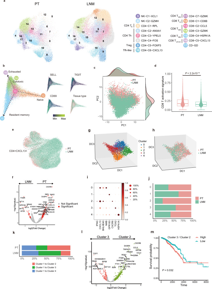
Fig. 2. T cell activity suppression in LNMT.
a A UMAP embedding plot of 58,316 T and NK cells grouped into 15 clusters from PTs and LNMTs of 8 patients. b The developmental trajectory of CD8 T cells is inferred by the diffusion map and colored according to tissue type and expression of example genes. c Scatter plot showing PCA components of CD8 T cells color-coded according to tissue type. The top density plot displays the distribution of CD8 T cells along PC1, the right density plot displays the distribution of CD8 T cells along PC2. d A box plot showing a comparison of the CD8 T activation score across tissues (PT: n = 9224 cells, LNMT: n = 7275 cells) as calculated by the normalized gene mean expression of T activation signature genes (Supplementary data 3) in CD8 T cells. Statistical testing was performed by a two-sided Wilcoxon test. In the box plots, the center line corresponds to the median, box corresponds to the interquartile range (IQR), and whiskers 1.5 × IQR. e A UMAP embedding plot showing CD4 clusters color-coded according to tissue type; the CD4-C6-CXCL13 cluster is circled. f A volcano plot showing the differentially expressed genes between PTs and LNMTs in the CD4-C6-CXCL13 subset. P value <0.05, log2 (fold change) ≥ 0.5. Statistical testing was performed by a two-sided Wilcoxon test. The P-values were corrected with Benjamini-Hochberg adjustment. g, h 3D projection of the CD4-C6-CXCL13 cluster inferred by a diffusion map and colored according to the subset (f) and tissue type (g). i A dot plot showing marker genes across 5 subsets of CD4-C6-CXCL13. The dot size indicates the fraction of expressing cells, and dots are colored according to normalized z score expression. j The proportion of tissues within 5 subsets in CD4-C6-CXCL13; the coloring is according to tissue type; the x-axis represents the fraction of tissues, and the y-axis represents major cell types. k Percentages of the differentiation direction of cluster 1 to other clusters in 2 microenvironments. l Volcano plot showing differentially expressed genes between cluster 2 and cluster 3. P value < 0.05, log2 (fold change) ≥ 0.5. Statistical testing was performed by a two-sided Wilcoxon test. The P values were corrected with Benjamini-Hochberg adjustment. m Kaplan-Meier plot shows that patients with breast cancer in the TCGA dataset (HER2+: n = 67 samples, LumA: n = 421 samples, LumB: n = 192 samples) with a high ratio of cluster 3 to cluster 2 have shorter overall survival. The ratio of cluster 3 to cluster 2 is the average expression of the cluster 3 signature genes divided by the average expression level of the cluster 2 signature genes. Statistical testing was performed by Log-Rank test. Source data are provided as a Source Data file.

