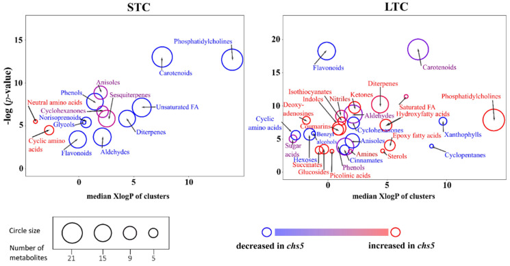
Figure 2.
Chemical similarity enrichment analysis (ChemRICH) of metabolic profiles. Each circle represents a significantly altered family of metabolites (cluster). These clusters are defined based on chemical similarities highlighted by a hierarchical Tanimoto map (not shown). The plot y-axis shows the statistical relevance of the altered clusters: the p-value is calculated by the Kolmogorov–Smirnov test. Only enrichment clusters are shown that are significantly different at p-value < 0.05. The plot x-axis shows the increasing hydrophobicity (or decreasing hydrophilicity), from left to right along the abscissa (expressed as XlogP value). The circle color scale gives the proportion of increased or decreased compounds in each cluster: red = increased in chs5, blue = decreased in chs5, and purple-color circles have both increased and decreased metabolites. The circle sizes represent the total number of metabolites belonging to the cluster.

