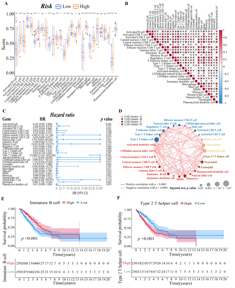
Figure 6.
Evaluation of immune microenvironment of LUAD patients. (A) Boxplots to display the enrichment scores of 28 immune cells of different risk groups in the training cohort. A value of p < 0.05 indicates a statistically significant difference, * indicates p < 0.05; ** indicates p < 0.01; *** indicates p < 0.001. (B) Correlation diagram between every two immune cells. The size of the circle and color represents the correlation coefficient R. Red indicates a positive correlation between two immune cells and blue indicates a negative correlation between two immune cells. (C) Forest plot of univariate regression Cox analysis based on 28 kinds of immune cells. (D) Cellular interaction of tumor microenvironment cell types. The size of each cell represents the survival impact of each immune cell type, which was calculated using the formula log10 (log-rank test p value). Cellular interactions are shown by the lines linking immune cells. The strength of connection calculated using Spearman correlation analysis is shown by the thickness of the line. The positive correlation is shown in red, while the negative connection is shown in blue. (E,F) The corresponding Kaplan–Meier survival curves of the immune cells that are significantly associated with survival ((E), immature B cell; (F), type 2 T helper cell).

