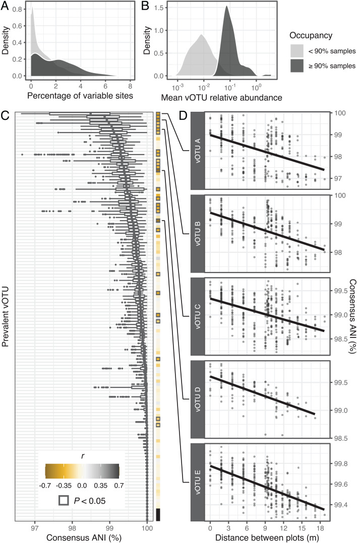
Fig. 2.
Spatial structuring of viral population microdiversity. (A and B) Kernel density plots showing the distributions of (A) microdiversity (measured as the percentage of polymorphic sites in a vOTU sequence) and (B) mean relative abundance within prevalent (≥90% occupancy) and nonprevalent (<90% occupancy) vOTUs. (C) Distributions of ANIs for each prevalent vOTU, calculated between pairs of sample-specific vOTU consensus sequences. Each box plot corresponds to a single vOTU, and the y axis is in rank order (ascending from top to bottom) of the median ANI value for each vOTU. Boxes display the median and interquartile range (IQR), and data points farther than 1.5× IQR from box hinges are plotted as outliers. The heat map on the right shows the Pearson's correlation coefficients between consensus ANI and spatial distance. Bold outlines indicate a significant P value (<0.05) for the correlation after multiple comparisons correction (Holm algorithm). Filled black squares correspond to vOTUs with no variation across samples (i.e., all ANIs were equal to 1). (D) The top five vOTUs with the most significant correlations (lowest P values) between consensus ANI and spatial distance. Each point represents a pair of samples, and the spatial distance between them was measured as the length of the line connecting the centers of the corresponding plots. Pairs of samples involving different time points were excluded from these analyses. The trend line displays the least squares linear regression model. Note that vOTUs are defined in part by sharing ≥95% ANI (see Materials and Methods), so within-vOTU ANI values will necessarily be ≥95% ANI. Also note subtle differences in the y axis range across graphs.

