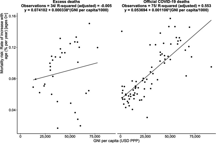
Figure 6.
displays the slope of the relationship between the rate of increase of mortality risk with age (% per year) and GNI per capita, for official COVID-19 deaths (left panel) and excess deaths (right panel), all data. Poisson model (estimates use all age groups and deaths recoded to 0 where they are negative).

