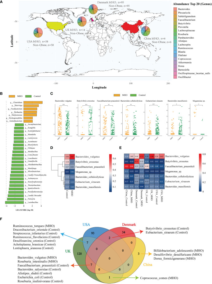
Figure 2.
Significantly-changed species in MHO individuals. (A) Geographic distribution of samples from four different projects. Each pie chart represents the composition of the top 20 abundant genera in MHO subjects. (B) LEfSe analysis: Plot of LDA effect size. The length of the bar column represents the LDA score. The figure shows the microbial taxa with significant differences at genus levels between the MHO (Yellow) and Control (green) (LDA score>2.0). (C) The difference of relative abundance in certain species between MHO and controls (Log2 transformed). * p 0.05 ** p 0.01 *** p 0.001. (D, E) Heatmap visualization of the mean abundance in MHO patients and healthy controls based on regional differences. Each column represents one subgroup based on the MHO or control groups in different countries. Each row represents one of the seven species. Values in each square represent the mean relative abundance in percentage (Log 10 transformed). The color scale was set based on the specific value of the mean relative abundance after the Log 10 transformation, with red for relative high abundance and blue for the low ones. (F) Venn diagrams illustrating the number of significantly enriched or depleted species between MHO and non-obese healthy controls in different countries. The MHO or control in parentheses means the group in which the species was enriched.

