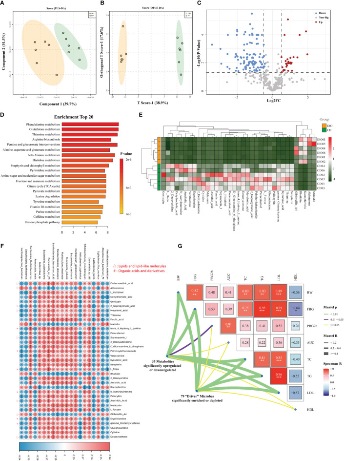
Figure 6.
Metabolomics analysis revealed aberrant metabolic patterns in MHO mice. Both PLS-DA (A) and OPLS-DA (B) showed a significantly-different distribution of metabolites in MHO and controls. (C) Volcano plot. The log2 fold-change indicates the mean relative abundance for each metabolite. Each dot represents one metabolite. The gray dots represent no significant expression difference between the MHO and control groups, the red dots represent MHO-enriched metabolites, and the blue dots represent MHO-depleted metabolites. (D) Enrichment analysis of differentially expressed metabolites shows the top 20 enriched pathways in MHO metabolism. (E) Heatmap visualization of the thirty-five metabolites with |LogFC|>4 in the MHO groups compared with the controls. (F) A correlation heatmap linking the top 20 significantly-differentiated bacteria with the above 35 significantly-changed metabolites. (G) The triangle on the right side represents pairwise comparisons of clinically relevant factors with a color gradient denoting Spearman correlation coefficients. The 79 significantly enriched or depleted microbes and 35 significantly changed metabolites were related to each clinical factor, respectively, using partial (geographic distance– corrected) Mantel tests. Edge width corresponds to the Mantel r statistic for the corresponding distance correlations, and edge color denotes the statistical p significance value. PLS-DA: The Partial least squares discriminant analysis; OPLS-DA: Orthogonal Partial least squares discriminant analysis. * p 0.05 ** p 0.01 *** p 0.001.

