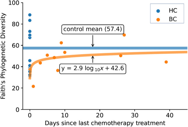
Figure 4.

Plot shows Faith’s phylogenetic diversity as a function of time since the last chemotherapy treatment for women who were diagnosed with and undergoing chemotherapy treatment for breast cancer (BC) relative to values for participants in the healthy control (HC) group. Orange dots represent BC samples, and the orange line shows a log curve fitted to the BC data with the resulting equation y = 2.9 log(x) + 42.6. Blue dots represent samples from HC participants who did not undergo chemotherapy and were artificially given an x value of 0, and the blue line shows the mean Faith’s phylogenetic diversity for the HC group.
