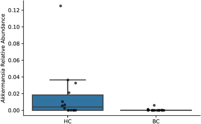
Figure 9.

A boxplot shows relative abundance of the phylum Akkermansia in women who were diagnosed with and undergoing chemotherapy treatment for breast cancer (BC) versus healthy controls (HC). Boxes represent the first and third quartiles, and horizontal lines within boxes represent median values. Whiskers represent non-outlier high and low values (defined by having a value less than 1.5 times the interquartile range of the first or third quartiles). Dots represent the relative abundances of Akkermansia in each sample.
