. 2022 Sep 7;82(22):4126–4138. doi: 10.1158/0008-5472.CAN-22-0948

Figure 2.

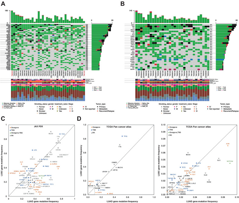
Figure 2. Oncoplot of the most frequently mutated genes in (A) LUAD and (B) LUSC PDX models. The oncoplot shows the PDX models in a horizontal orientation, annotated with smoking status, gender, treatment naïve status, stage of cancer, and tumor type. Genes with mutation frequency >30% is shown on the vertical axis. The barplot at the top has the frequency of mutations for each PDX model, whereas the right barplot has the frequency of mutations in each gene. Colors in the oncoplot columns indicate different mutation types (see legend for details). The bottom panel shows the classification of the SNPs into transitions and transversions. Model IDs in red originate from the same patient. C, Comparison of gene mutation frequency in LUAD and LUSC PDX models (frequency >30%). D, Comparison of gene mutation frequency in LUAD and LUSC TCGA samples (left: frequency >10%; right: frequency < 10%). Oncogene and TSG annotations from OncoKB.

A and B, Oncoplot of the most frequently mutated genes in LUAD (A) and LUSC (B) PDX models. The oncoplot shows the PDX models in a horizontal orientation, annotated with smoking status, gender, treatment naïve status, stage of cancer, and tumor type. Genes with mutation frequency >30% are shown on the vertical axis. The barplot at the top has the frequency of mutations for each PDX model, whereas the right barplot has the frequency of mutations in each gene. Colors in the oncoplot columns indicate different mutation types (see legend for details). The bottom panel shows the classification of the SNPs into transitions and transversions. Model IDs in red originate from the same patient. C, Comparison of gene mutation frequency in LUAD and LUSC PDX models (frequency >30%). D, Comparison of gene mutation frequency in LUAD and LUSC TCGA samples (left, frequency >10%; right, frequency < 10%). Oncogene and TSG annotations from OncoKB.