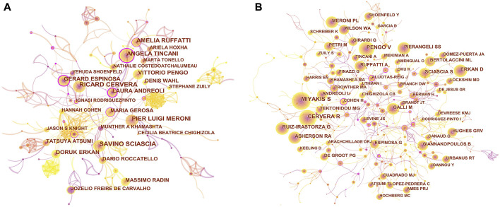
FIGURE 3.
(A) CiteSpace visualization map of authors in APS research. (B) CiteSpace visualization map of co-cited authors involved in APS. Each circle represents an author, and the size of the circle is proportional to the publication count (A) or the number of citations (B). The circles with higher centrality (>0.1) are displayed with purple rings. The lines represent the strength of the co-authorship (A) or co-cited relationship (B), with thicker lines representing stronger collaboration (A) or relevancy (B). The color of the line represents the time of the first co-authorship, with a more yellow color meaning closer to 2021 and a more red color meaning closer to 2012.

