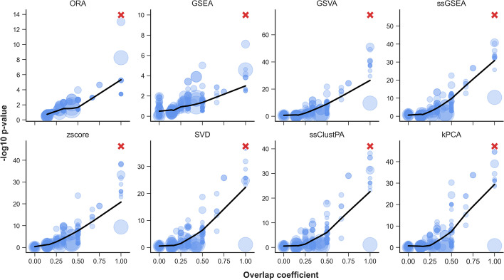
Fig. 3.
The relationship between pathway overlap and significance. The artificially enriched pathway (R-HSA-1483206) is represented by a red cross. Overlap coefficient values of each pathway with R-HSA-1483206 are shown on the x-axis. t-test p-values of pathway scores (testing for significant difference in mean pathway score between disease and control group) for each pathway are shown on the y-axis (-log10 scale). Note, for GSEA the p-values are calculated using the original GSEA permutation procedure, and for ORA, p-values are calculated using the Fisher’s exact test. A LOWESS regression line is shown in black. Point size corresponds to the coverage of each pathway (i.e. the number of metabolites in the pathway which were present in the dataset)

