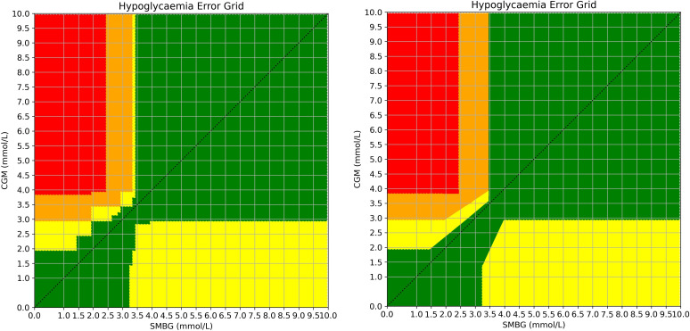
Figure 2.
Demonstration of the averaged risk scores for all 10,000 combinations of SMBG vs CGM values before (left) and after smoothing (right). Risk levels: green = A, yellow = B, orange = C, red = D. The original grid generated by responses is demonstrated on the left with the smoothed grid on the right. For the final version, the slim vertical yellow column and the adjacent orange sections were combined. Staggered edges were converted to angled straight lines by consensus to aid usability and replication.

