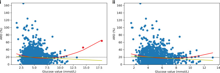
Figure 5.
Scatter plot of absolute relative difference (ARD) between CGM and SMBG by glucose value. Yellow line = linear line of best fit, red line = 2nd degree polynomial line of best fit, black dotted line = mean absolute relative difference (MARD). Figure i) shows a linear negative correlation between glucose value and ARD with ARD decreasing as glucose increases. However, the 2nd degree polynomial shows a U shaped curve with the greatest accuracy in the normal glucose range from 5-9mmol/L. When the two hyperglycaemia outliers (red) are removed, the relationships are not significantly altered (ii).

