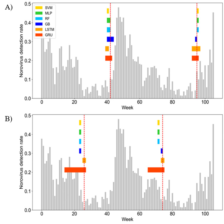
Fig 5. Comparison of early detection of norovirus between six machine learning algorithms for test data.
A) start week of early detection and B) end week of early detection. The vertical red dotted lines indicate an observed start and end week of norovirus warning phase. The horizontal color bars indicate a predicted interval for start and end week of norovirus warning phase using SVM (yellow), MLP (green), RF (pale blue), GB (blue), LSTM (orange), and GRU (red). The gray bars indicate an observed weekly detection rate of norovirus.

