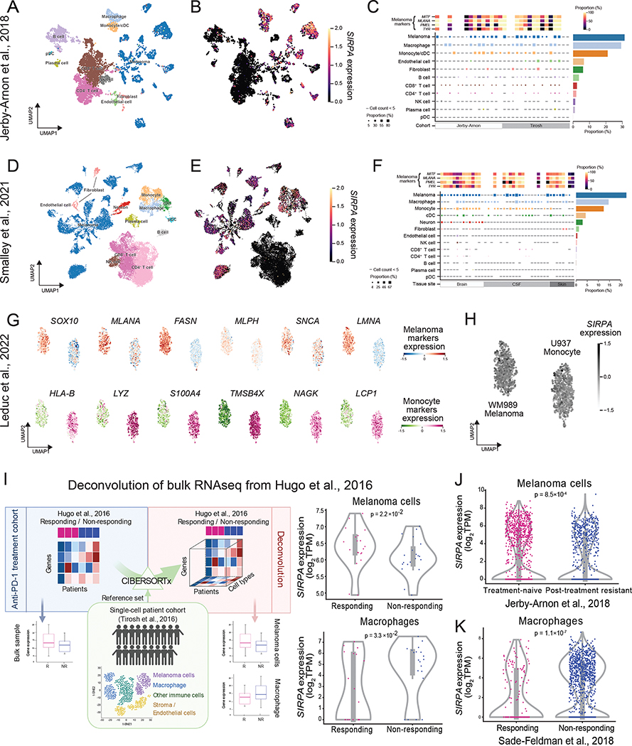
Figure 2. SIRPA expression in tumor cells and macrophages in melanoma patient samples.
(A, B) UMAP plot visualizing cell type annotations (A) and SIRPA expression (B) in single cells of a melanoma patient cohort from Jerby-Arnon et al. (C) Top panel, a heatmap showing the proportion of cells positive for four melanoma gene markers in all melanoma cells of each patient. Middle panel, a heatmap showing the proportion of SIRPA+ cells in different cell types of each patient. Right panel, a bar plot showing the proportion of SIRPA+ cells in different cell types where cells from all patients are combined. (D-F) Same as (A-C) but for another melanoma patient cohort from Smalley et al. (G) UMAP plot visualizing protein expression levels of six melanoma markers (top panel) and six monocyte markers (bottom panel) in single cells of a melanoma cell line (top panel) and a monocyte cell line (bottom panel), respectively. (H) UMAP plot visualizing SIRPα protein expression level in the two cell lines as mentioned in (G). (B, E, G, H) The color key indicates normalized mRNA expression for a gene of interest. (C, F) The color key indicates the proportion of positive cells. (I) Left panel, the workflow of deconvoluting bulk gene expression profiles into cell type-specific gene expression profiles. Right panel, violin plots showing differential SIRPA expression by deconvolution between responding and non-responding groups in melanoma cells and macrophages, respectively. R, responding to anti-PD-1 therapy; NR, non-responding. (J, K) Violin plots showing differential SIRPA expression by scRNA-seq between anti-PD-1 treatment-naïve and post-treatment resistant groups in melanoma cells (J) or between responding and non-responding groups in macrophages (K). (I, J, K) Each violin plot shows the data distribution using a kernel density estimation. The width of the violin plot represents a probability that the data points will take on the given value, and the top and bottom lines indicate the maximal and minimal data values. The bottom and top of the inner box are the first and third quartiles, and the whiskers extend to the 1.5× interquartile range of the lower and the upper quartiles, respectively. See also Figure S2.

