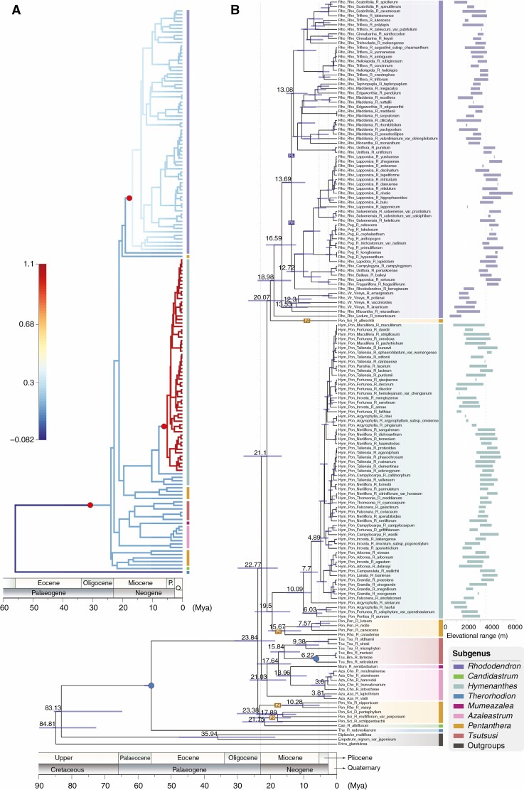
Fig. 2.
Combined chronogram and phylorate plot of Rhododendron. (A) Phylorate plot with branches coloured according to the mean posterior density of net diversification rate (speciation rate minus extinction rate). Blue in the scale represents low rates and red represents high rates. Red circles mark the positions of rate shift in the MAP configuration. (B) Divergence time estimation based on BEAST analysis. The blue bars correspond to the 95 % HPD credibility intervals of age estimates. Nodes with solid blue circles are constrained with fossils.

