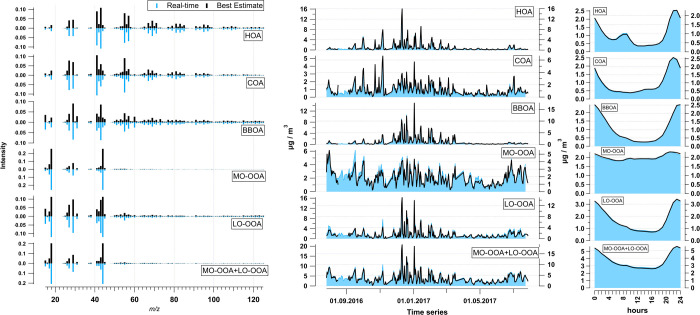
Figure 2.
Yearly averaged source apportionment comparison for Athens data for factor profiles (left, with mirrored y-axis), a time series with a 24 h resolution (middle), and diurnal cycles (right). The blue color indicates the real-time results and the black color indicates the best-estimate results.

