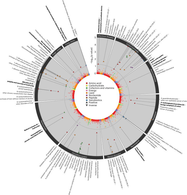
Fig. 6. Summary of phenome-wide associations with metabolite scores.
The circos plot displays adjusted P values (q value) from logistic regression models testing for pairwise associations between 155 genetically predicted metabolite levels (scores) and 1,457 phecodes in the UK Biobank. Each dot represents one metabolite–phecode association, and colors reflect metabolite classes. Associations passing the multiple testing correction cutoff (q < 0.05) are indicated by larger triangles, the orientation of which indicates the association direction, and are annotated at the outer margins of the plot. Metabolite score–phecode associations with robust evidence for a dose–response relationship are indicated in bold (see text). Effect estimates, standard errors and P values are provided in Supplementary Table 14.

