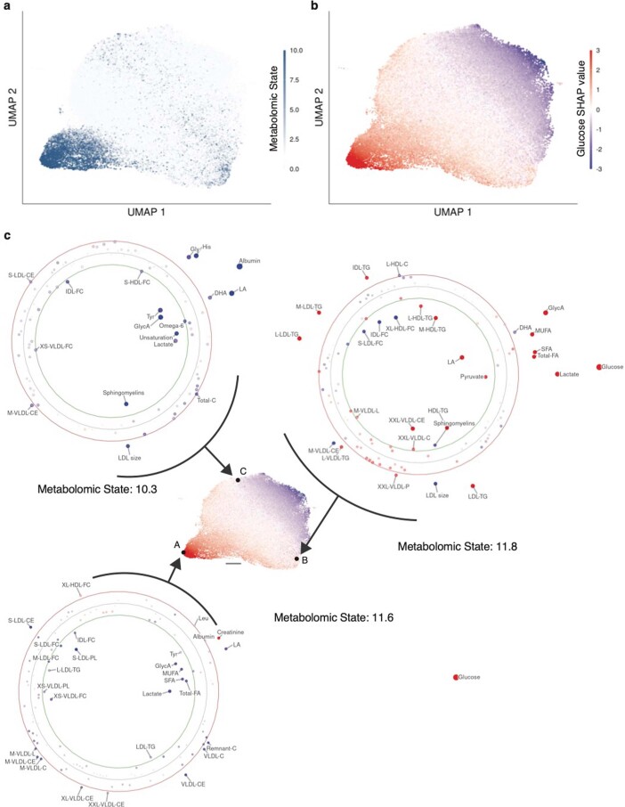
Extended Data Fig. 9. Individual attribution profiles diverge for high-risk individuals in T2D.
The UMAP projection allows an assessment of the complex, high-dimensional manifold of attribution values in 2-dimensional space. For visualization, 41 unconnected outliers of 117981 total observations were excluded. a) UMAP of the SHAP value metabolite attributions for T2D for the entire study population colored by each individual’s metabolomic state. b) The same UMAP colored by the Glucose SHAP value. c) Displays individual attribution profiles for three high-risk (metabolomic state > 10, top 1% metabolomic state percentile) individuals, indicated by the letters A, B, C in the central UMAP. The three individual attribution profiles are dominated by different metabolites. The scale bar represents a unit in the UMAP space. The individual attribution profiles are set up equivalently to Figure 6: Each point in an individual attribution profile indicates one metabolite; the position, size, and color of the point indicate the magnitude and direction of the attributed contribution to predicted risk. The green and red circles represent the bounds of the top and bottom percentile of the global SHAP distribution, respectively, indicating outliers in the SHAP global distribution.

