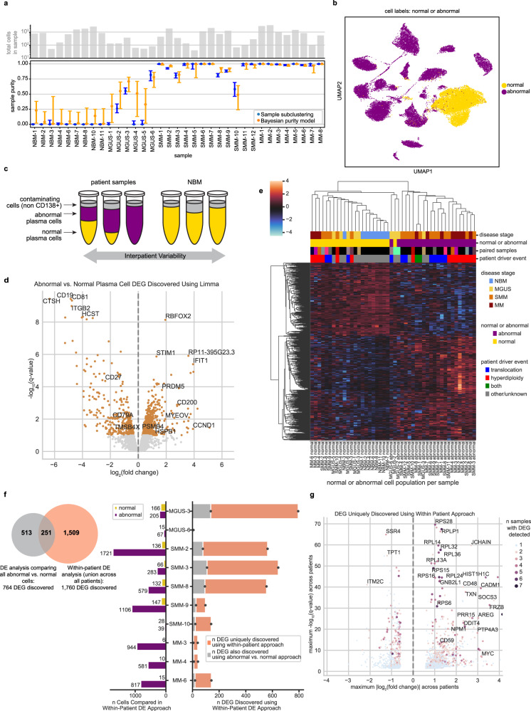
Fig. 2. In silico dissection of transcriptional differences in normal and abnormal plasma cells within patient samples.
a The number of cells (top) and estimated purity of each sample with 95% confidence intervals (bottom). Sample purity was estimated using two orthogonal methods: clustering of individual samples (blue; the fraction of cells labeled abnormal per sample is plotted) and our Bayesian hierarchical purity model (orange; the mode of posterior sample purity is plotted). Source data are provided as a Source Data File. b UMAP localization of individual cells labeled normal or abnormal. c Cartoon schematic of our differential expression analysis. We run two DE analyses: First, we compare all abnormal (purple) vs. all normal (yellow) cells using limma-voom. Next, we compare patients’ abnormal cells to their own normal cells, controlling for inter-patient variability. Samples with 100% normal or abnormal cells were excluded from the within-patient analysis. d Volcano plot of limma-voom DE results for abnormal vs. normal cell populations. Orange denotes genes with q-value < 0.1. The 4 most significantly up- and downregulated genes and other selected genes are annotated. e Pseudobulk expression of DEGs detected between abnormal and normal pseudosamples using limma-voom (z-scored per gene). Each column represents the normal or abnormal cells from a given sample. Color annotations denote disease stage (top), normal or abnormal (second), paired columns coming from the same sample (third; matching colors denote that columns correspond to the same sample; black denotes that there was no paired sample), and whether IgH translocation or hyperdiploidy was detected in that sample by iFISH (bottom). f Quantification of DEGs uniquely discovered using within-patient DE. The venn diagram represents the overlap of DEGs found using limma-voom and our within-patient DE approach. The bar plot describes the number of DEGs found per sample using within-patient DE (right side) and the number of abnormal and normal cells per sample (left side). g Volcano plot of 1760 DEGs uniquely discovered using our within-patient DE approach. The y-axis represents the maximum -log10(q-value) of the gene across samples included in the within-patient analysis, and x-axis represents the maximum log2(fold change). The color and size of a dot denote the number of samples for which that DEG was detected, with blue dots representing DEGs detected in just one sample.

