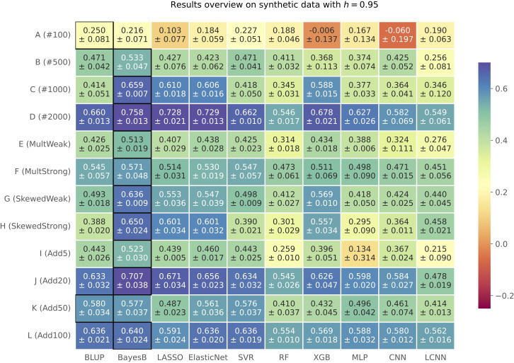
Figure 1.
Results on synthetic data with h=0.95 shown in a heatmap: Each cell gives the explained variance v that the prediction model given on the horizontal axis achieved for the simulation configuration specified on the vertical axis. The color of each cell ranging from dark red to dark blue represents the prediction performance. The best result for each simulated phenotype is highlighted by a black frame around the cell.

