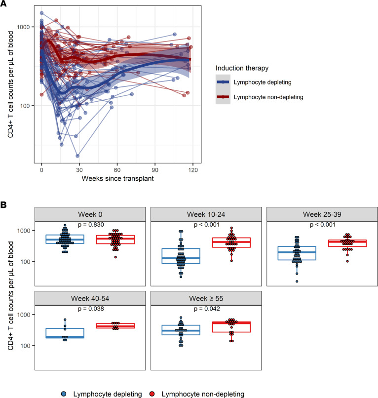
Figure 1. Longitudinal trajectories of CD4+ T cell counts per μL of blood following kidney transplant.
(A) CD4+ T cell counts were measured longitudinally from time since transplant among patients who received lymphocyte-depleting or -nondepleting treatment. Each line represents an individual, and each dot represents a time point. Blue and red lines represent the locally estimated scatter plot smoothing (LOESS) curves for lymphocyte-depleting and -nondepleting groups, respectively. Gray shaded areas represent the 95% CI of the LOESS curves. (B) Comparisons between therapy groups were further analyzed and subdivided into time bins. Each dot represents an individual analyzed within a time bin. Box plots represent the IQR. Medians are represented by horizontal lines in the boxes. The lower and upper whiskers represent 1.5 times the IQR beyond the quartiles. P values were estimated by Wilcoxon’s rank-sum test.

