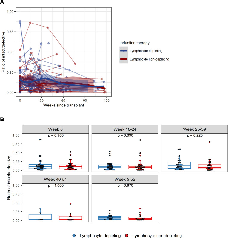
Figure 4. Ratio of intact/defective provirus frequencies following kidney transplant.
(A) Intact-to-defective proviral ratios were measured longitudinally from time since transplant among patients who received lymphocyte-depleting or -nondepleting treatment. Each line represents an individual, and each dot represents a time point. Blue and red lines represent the locally estimated scatter plot smoothing (LOESS) curve for lymphocyte-depleting and -nondepleting groups, respectively. Gray shaded areas represent the 95% CI of the LOESS curves. (B) Ratios were further summarized by time point and compared by therapy group. Blue lines indicate participants who received lymphocyte-depleting therapy, and red lines indicate participates who received nondepleting therapy. Each dot represents an individual analyzed within a time bin. Box plots represent the IQR. Medians are represented by horizontal lines in the boxes. The lower and upper whiskers represent 1.5 times the IQR beyond the quartiles. P values were estimated by Wilcoxon’s rank-sum test.

