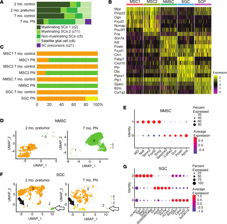
Figure 2. Normal SC clusters change abundance and gene expression in PNs, and PNs contain SCP-like cells.
(A) Cell type frequencies across SC UMAP clusters. For each cell type, a UMAP cluster number (from B) is given in parentheses. (B) Heatmap showing the top 5 markers for each cluster, generated in Seurat. Shared markers are shown once. For visualization, each cluster was subsampled to 100 cells during heatmap generation. (C) Bar graph shows the percentage of SCs in each cluster that are normal (orange) or show changed gene expression in PNs (green or yellow). (D) A UMAP of NMSCs shows the shift in gene expression in PNs revealed by subcluster analysis. (E) Dot plot showing the top 5 markers for NMSC subclusters. On the y axis, “Identity” numbers represent cell subcluster numbers. (F) A UMAP of SGCs shows the shift in gene expression in PNs revealed by sucluster analysis; 1 SCG appears transiently (white arrows), the other (cluster 1) enlarges in PNs (black arrows). (G) Dot plot showing the top 5 markers for each of 3 SCG subclusters (green and yellow in F).

