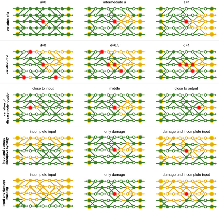
Figure 2.
Schematic summaries of various aspects of the model. Red indicates non-functional nodes (i.e. the genetic predisposition for a disease, ‘disease nodes’). Green nodes and links indicate activity (‘flux’). Inactive components are indicated in yellow. All rows (except for the first one) use the same (intermediate) value of a. The first row shows how a affects the impact of non-functional nodes. The second row illustrates the effect of different clustering for the same number of non-functional nodes . The third row shows how the position of the non-functional nodes can affect the phenotype. The fourth row is an example of synergistic effects between network and environment. The fifth row shows an example of a genetic disease being masked by environmental factors.

