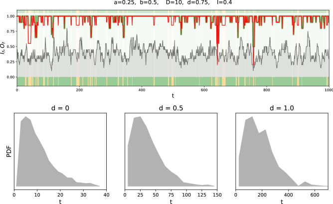
Figure 3.
Top panel: time series of the number of active inputs (grey background) and the output strength for the healthy (green) and the disease (red) network. A difference between the red and the green curve (red below green) indicates visible symptoms. The type of the observed disease is indicated by the colour bar (colour code as defined in Fig. 1a). Further time series for different sets of parameters can be found in the supplement. Bottom panel: histograms of disease incidences for different values of .

