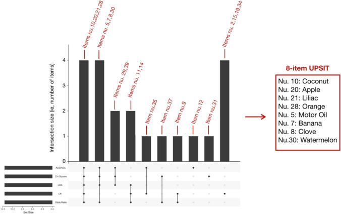
Fig. 1.
UpSetR plot showing odors selected across the different statistical models. The red numbers represent the items (odors), as they are numbered in the UPSIT test, selected by the different statistical models. Odors selected by at least 4 statistical models are shown on the right, being the final 8-item UPSIT. Column height depends on how many items are selected by the statistical models shown at the bottom (Abbreviations: LR = logistic regression, LDA = linear discriminant analysis, AUC-ROC= area under the receiver operating characteristic curve). The set size (i.e., the black bars on the left) represents the number of items chosen for each statistical method (in our case, 12)

