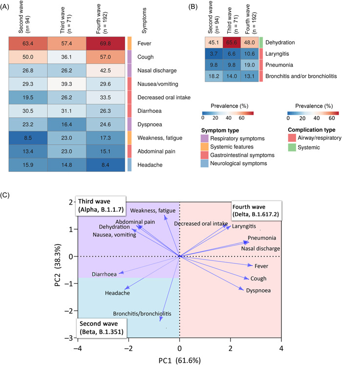
Figure 3.

Characteristics of different waves. (A) The heatmap show the prevalence of the symptoms in the different waves. The columns and rows represent the different waves and symptoms, respectively. The heatmap represents the symptoms with prevalence over 10%. (B) The heatmap show the prevalence of the complications in the different waves. The heatmap represents the complications with prevalence over 8.3%. (C) The biplot from principal component analysis revealing the relationship between the symptoms, complications, and the different waves. Arrows indicate symptoms and complications, pointing to each wave in two‐dimensional space. Arrow length and direction are informative: longer arrows are more specific, whereas shorter arrows indicate more general symptoms and complications. Symptoms and complications that are close to each other at right angles are not correlated. Angles smaller than right angles indicate a positive correlation, whereas angles larger than right angles indicate a negative correlation. The different colors in the plot represent the waves. Their area is scaled according to which wave the arrows are most associated with.
