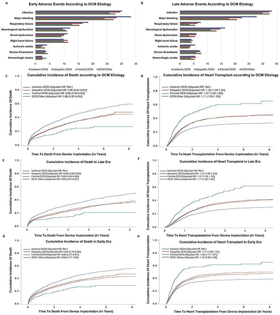
Figure 1. Clinical Outcomes Among Familial Dilated Cardiomyopathy Patients Receiving a Mechanical Circulatory Support Device.

Part A and B: These bar graphs depict the percentage of early and late adverse events stratified by DCM etiology. The blue, red, green, and brown bar depicts ischemic DCM, idiopathic DCM, familial DCM, and DCM due to other causes, respectively.
Part C: Kaplan-Meier curves for the risk of death post MCSD implantation stratified by DCM etiology, taking heart transplantation as a censoring event. The blue, red, green, and brown curve depicts ischemic DCM, idiopathic DCM, familial DCM, and DCM due to other causes, respectively.
Part D: Kaplan-Meier curves for the cumulative incidence of heart transplantation stratified by DCM etiology. The blue, red, green, and brown curve depicts ischemic DCM, idiopathic DCM, familial DCM, and DCM due to other causes, respectively.
Part E: Kaplan-Meier curves for the cumulative incidence of death in the late era stratified by DCM etiology. The blue, red, green, and brown curve depicts ischemic DCM, idiopathic DCM, familial DCM, and DCM due to other causes, respectively.
Part F: Kaplan-Meier curves for the cumulative incidence of heart transplantation in the late era stratified by DCM etiology. The blue, red, green, and brown curve depicts ischemic DCM, idiopathic DCM, familial DCM, and DCM due to other causes, respectively.
Part G: Kaplan-Meier curves for the cumulative incidence of death in the early era stratified by DCM etiology. The blue, red, green, and brown curve depicts ischemic DCM, idiopathic DCM, familial DCM, and DCM due to other causes, respectively.
Part H: Kaplan-Meier curves for the cumulative incidence of heart transplantation in the early era stratified by DCM etiology. The blue, red, green, and brown curve depicts ischemic DCM, idiopathic DCM, familial DCM, and DCM due to other causes, respectively.
