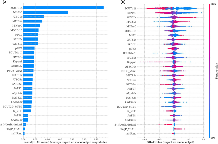
Fig. 3.
SHAP feature importance plots. (A) The left bar plot represents a ranking of the importance of the variables with their average impact on model prediction. (B) The right dot plot represents each data point with the signed contribution of each variable to the model prediction: blue colour indicates low values for a variable whereas red colour indicates high values. (For interpretation of the references to colour in this figure legend, the reader is referred to the Web version of this article.)

