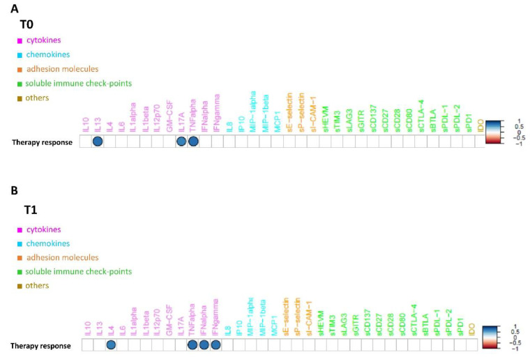
Figure 3.
Connectivity map between molecules’ profiles and therapy response values at T0 (A) and at T1 (B). Statistically significant Spearman correlations (p-value ≤0.05) are reported. In the plot, circles are scaled and colored according to the correlation values, increasing from red (negative correlation) to blue (positive correlation). Molecules are grouped and ordered according to the functional group reported in the legend.

