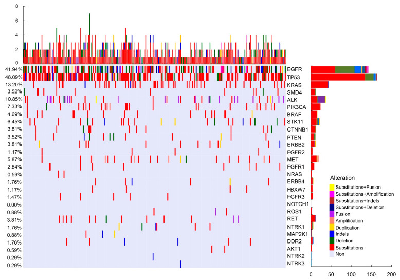
Figure 1.
Mutation profile of the cohort. Each row represents a gene and each column represents a patient. The bar located at the bottom left denotes the mutation count of respective genes. Top plot represents the overall number of mutations that a patient carried. Different colors denote different types of mutations.

