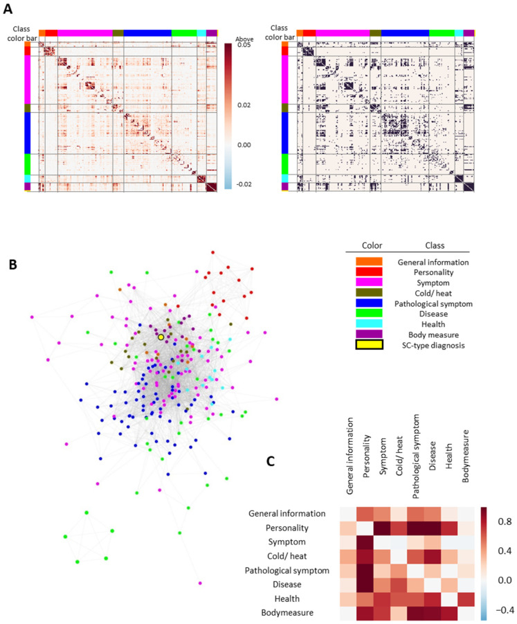
Figure 2.
Construction and visualization of the feature network: (A) the association matrix between clinical features or SC types. Each feature in the heatmap is ordered according to its feature class. Data were visualized as raw adjusted mutual information (MI) values (left) or whether values exceeded the excess cutoff value (right); (B) visualized feature networks. Class color bar in the heatmap and the node color in the feature network indicate the feature class. Specifically, the yellow circle with black outline represents the SC-type diagnosis. The edges between nodes indicate that the MI value between features is greater than the cutoff value (0.01); (C) feature network separation between feature classes. Positive separation values indicate that two classes are well-distinguished at the network level, while negative values imply overlapping between two classes.

