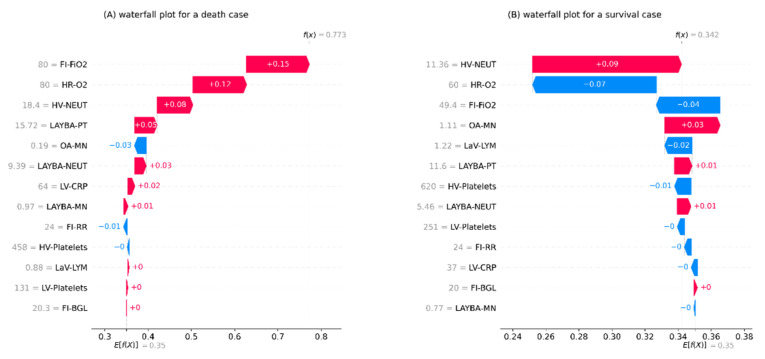
Figure 3.
The local interpretation plots for the developed inpatient COVID-19 mortality prediction model. (A) an example of patients with survival as the outcome of admission, (B) an example of patients with death as the outcome of admission. The plots start from the bottom with a predefined prediction for the risk of death equal to the average death rate in the training set. Next, the arrows with an ascending order show how each feature has contributed to the formation of a final prediction specified for the given data instance shown at the top of the plot. Note. BGL: blood glucose level; CRP: c-reactive protein; FI: first inpatient; FiO2: fraction of inspired oxygen; HR: highest requirement; HV: highest value; LaV: last value; LAYBA: latest available within one year before admission; LV: lowest value; LYM: lymphocytes; MN: monocytes; NEUT: neutrophils; OA: on admission; O2: oxygen; PT: prothrombin time; RR: respiratory rate; SHAP: SHapley Additive exPlanations.

