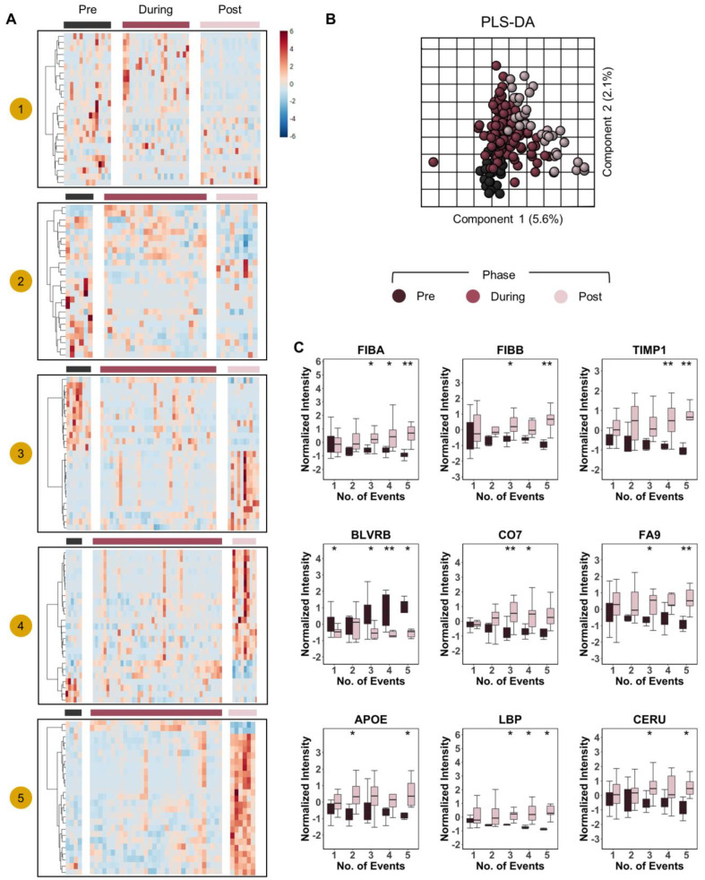
Figure 7.
Dose-response effect of pRBC transfusion on the plasma proteome. In (A), heat maps of top 25 proteins that changed significantly in response to transfusion as measured by ANOVA (y-axis) with patients on the x-axis. The heat maps were divided into transfusion phases “pre-during-post” and grouped by the number of transfusion “events” 1–5. In (B), PLS-DA of patient proteomes grouped by transfusion phase. Patients that received strictly greater than one transfusion event were included in PLS-DA. In (C), we show box plots of select proteins that changed significantly in response to transfusion. Box plot colors correspond to pre and post transfusion time points, consistent with panels (A,B). ** p < 0.01, * p < 0.05.

