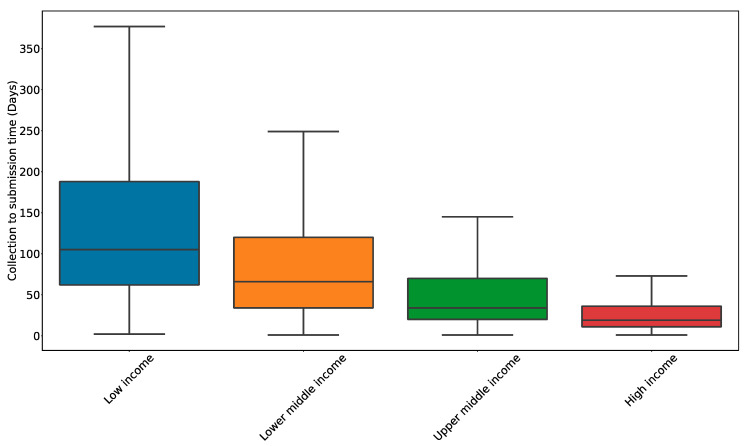
Figure 3.
Lag time from specimen collection to sequence reporting on GISAID by income status. Data were pulled from GISAID (accessed 5 September 2022) and Worldbank and are presented as a boxplot. The box represents the lower and upper quartiles (Q1 and Q3, respectively) and the line within the box represents the median. The whiskers represent the rest of the data distribution except for the points deemed outliers (defined as 1.5 × IQR + Q3 or 1.5 × IQR − Q1 where IQR = Q3 − Q1).

