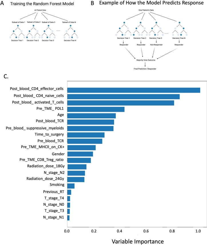
Extended Data Fig. 8. Predictor importance plot for the random forest model averaged across the random initializations.
(A) Diagram depicting how the random forest model was trained. (B) Diagram depicting an example of how the model will determine if a patient responds to treatment. (C) Predictor importance is computed using the mean decrease in Gini index and plotted relative to the CD4+ effector T-cell importance, which had the maximum mean decrease in Gini index among the predictors. This figure was made with Python version 3.6.3 and Matplotlib version 3.2.2.

