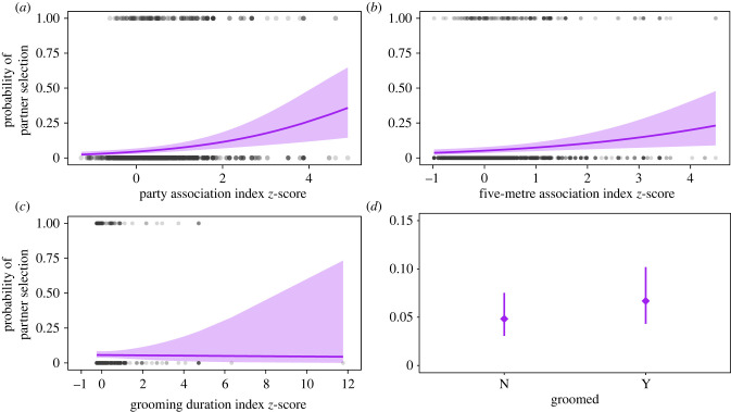
Figure 3.
Results from the partner selection analysis full model showing the effect of each relationship quality measure on the probability of partner selection. In (a–c), each grey datapoint represents one dyad at the time of a coalition, and purple lines show model predictions with 95% confidence intervals. In (d), purple diamonds show the predicted mean ± 95% confidence interval (note different y-axis scaling in d). (Online version in colour.)

