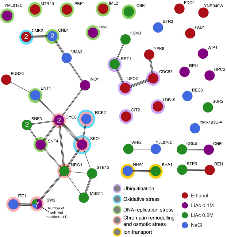
Fig. 6.
Protein–protein interaction network of all genes affected by de novo mutations that reached a frequency of at least 35% at some point during the experiment. Each node is a pie chart of the proportion of mutations per gene that occurred in each environment (all present in a single environment, except for ISW2). The number of unlinked independent mutations is indicated within each node if a gene was hit by more than one mutation (two mutations in the genes SUR2 and SNF3 have linked allele frequency trajectories and were counted as one). The links represent different sources of interaction evidence detected by the STRING database. Main functional categories are depicted by rings around the nodes.

