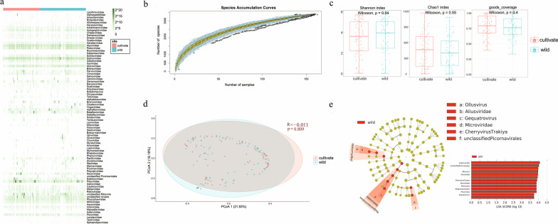
Fig. 2.
Analysis of virus community diversity in cultivated and wild plants. a Taxonomic analyses at the family level. The heatmap shows the reads counts of each virus family on a log2 scale. Plant types are indicated by the corresponding colors (see color legend). The row name on the right represents the name of the virus family. b Species accumulation curve. The abscissa represents the number of libraries, and the ordinate represents the number of species found. The blue shading indicates the 95% confidence interval. c Comparison of alpha diversity between the two groups (Shannon index, Chao1 index, and goods_coverage). The horizontal bars inside boxes represent medians. The tops and bottoms of boxes represent the 75th and 25th percentiles, respectively. The upper and lower whiskers extend to data no more than 1.5 × the interquartile range from the upper edge and lower edge of the box, respectively. The plant types are indicated with the corresponding colors (see color legend). d Principal coordinates (PCoA) analysis. The PCoA analysis shows the differences in species composition based on the Bray–Curtis ecological distance matrix. The P-value is calculated by ANOSIM. e Linear discriminant analysis Effect Size (Lefse). Circles radiating from inside to outside represent taxonomic classes from phylum to genus. Each small circle at a different taxonomic level represents a taxon at that level, and the small circle diameter size is proportional to the relative abundance size. Species without significant difference are uniformly colored yellow, and differential species Biomarker follows the group for staining. Red nodes indicate microbial groups that play an important role in red groups. Only taxa with LDA values of 3.0 or higher are shown

