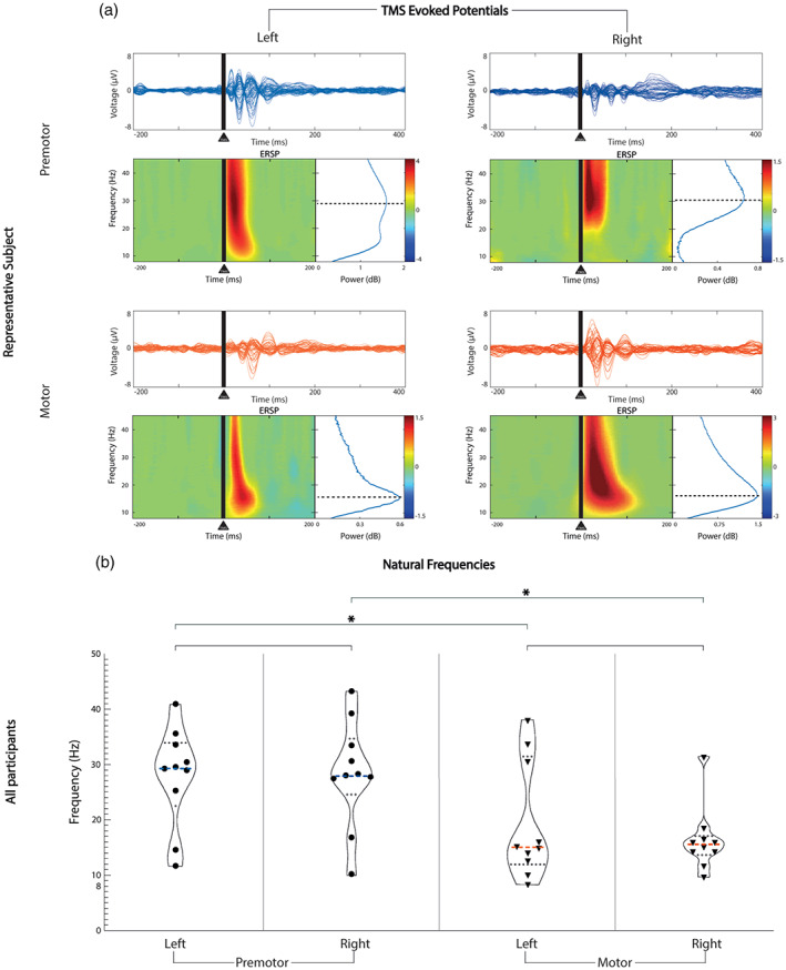
FIGURE 2.

Natural frequency comparison between contralateral homologous and ipsilateral CAs. Horizontal lines represent statistical comparisons. (a) For a representative participant (P1), at the top of each area, we show the channel voltages averaged across trials between −200 and 400 ms from the stimulus, on a scale between −8 and 8 μV for each area (butterfly plots). Under each butterfly plot on the left, we present the time‐frequency decomposition averaged across all the channels between 8 and 45 Hz. At the bottom right of each butterfly plot, we show the cumulative ERSP from 20 to 200 ms. (b) Violin plot showing the full distribution of natural frequency data for each area derived from panel a across all participants. The median is represented by the bold dashed line in each plot. The median resulted from left premotor is 29.37 Hz, from right premotor is 27.94 Hz, from left motor is 15.03 Hz, from right motor is 15.61 Hz. Dotted lines represent the quartiles distribution of the natural frequencies for each area. Blue: premotor CAs, red: motor CAs; *, statistically significant comparisons; CA, cortical area; ESRP, event‐related spectral perturbation
