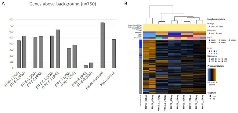
Figure 1.
(A) Bar plot of the genes detected above the background; for each sample, the RNA input in ng is reported in brackets. (B) Unsupervised heatmap of the 5 sample pairs assessed in the study. Samples are categorized into A, with DV200 = 100%; B, with DV200 > 70%; C, with DV200 = 50% to 70%; D, with DV200 = 30% to 50%; and E, with DV200 < 30%. None of the samples displayed in the figure had a DV200 = 100%; hence no sample is represented into category “A”. The “good” category refers to samples with DV200 > 50% while the “bad” category refers to samples with DV200 < 50%. Orange indicates high expression; blue indicates low expression.

