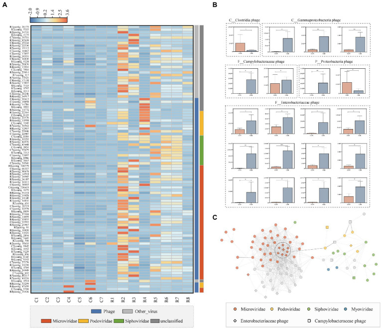
Figure 3.
Differential viral profile and the correlations between the differential virus contigs of the two groups. (A) Heatmap of the differential virus contigs (the top 100 of relative abundance); the color scale bar shows z-score values after z-score row normalization. (B) Bar plot of 20 differential viral contigs, of which the potential bacterial hosts were predicted. The data are represented as the mean ± standard errors of the means (SEM). *p < 0.05, **p < 0.01, ***p <0.001. (C) The differential virome co-expression network with Spearman’s rank correlation coefficient (|r|>0.6, p < 0.01). Dots with different colors indicate different families.

