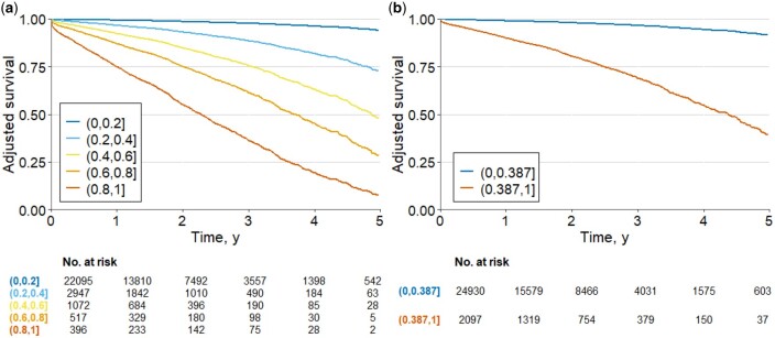
Figure 5.
Adjusted survival curves for the risk of new AF. The plots display the survival curves for the different cohorts. The curves were computed from probability results of ML model. The models were adjusted by age and gender. In (A) the model with quintiles of probability and (B) the model with probability less or equal than 0.387 and those with probability greater than 0.387.

