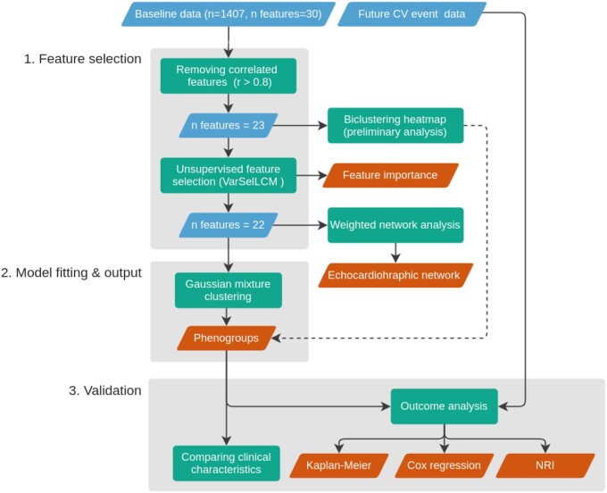
Figure 1.
Unsupervised machine learning workflow. The blue and orange rhomboids represent the input data and the output of the analysis, respectively. Rectangles describe the performed analytical steps. Arrows show the workflow of the analysis. The dashed line represents the supportive evidence for the phenogroups. For a detailed explanation see the Methods section.

