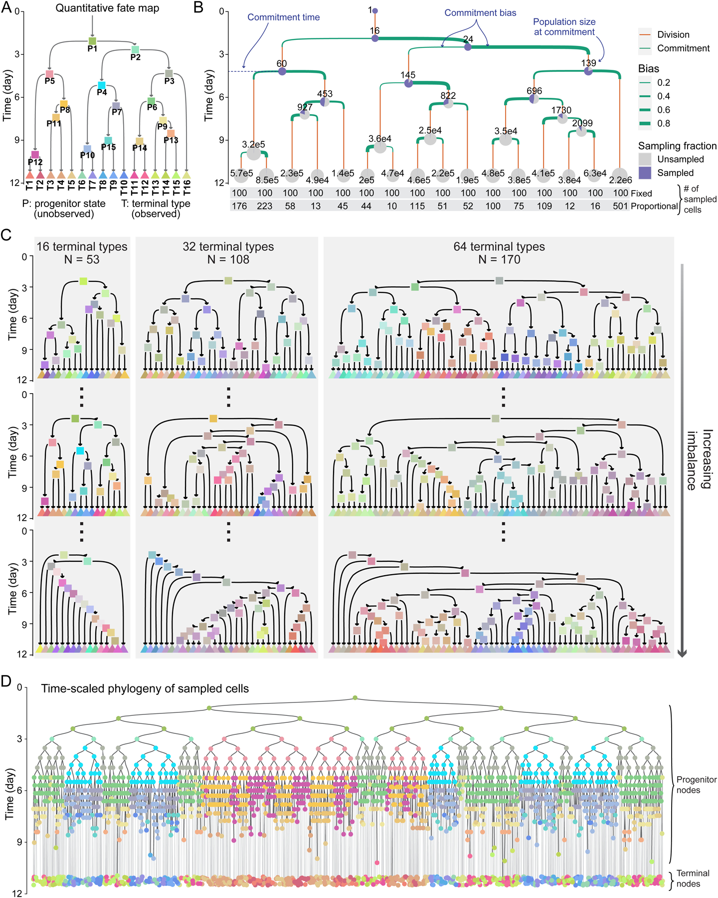
Figure 1. Simulating time-scaled phylogenetic trees of sampled cells based on a panel of quantitative fate maps.

(A) Topology of a quantitative fate map. Arrows represent cell states, colored rectangles represent their commitment events. Triangles represent terminal types at the time of sampling.
(B) Quantitative fate map in A annotated with commitment time, population size, and commitment bias of its progenitor states. Pie charts show sampling fraction under fixed sampling at progenitor state commitment time or terminal type sampling; numbers on pies show corresponding true population sizes. The bottom two rows show the number of cells sampled from each terminal type under fixed and proportional sampling.
(C) The panel of 331 quantitative fate maps. The maps are in three sizes of 16, 32, and 64 terminal cell types. Three examples of each size are shown, including the most balanced (top) and the most unbalanced (bottom).
(D) Example time-scaled phylogeny of sampled cells generated by fixed sampling of 100 cells from each terminal type in the fate map shown in A. Node colors based on A.
See also Figures S1 and S2.
