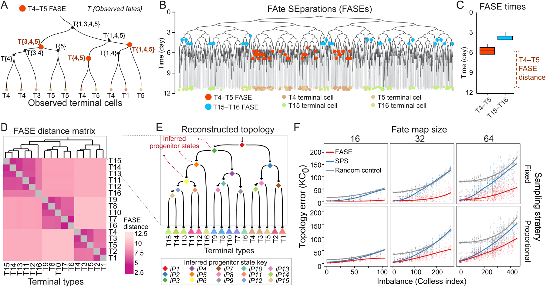
Figure 2. Reconstructing fate map topology from time-scaled phylogeny of sampled cells.

(A) Example phylogenetic subtree. Each internal node is labeled with its observed fate. T4–T5 FASEs are colored orange.
(B) Phylogeny from Figure 1D showing T4–T5 (orange) and T15–T16 (blue) FASEs. T4, T5, T15, and T16 are colored according to the key on the bottom.
(C) Boxplots showing the temporal distribution of T4–T5 and T15–T16 FASEs in the tree in B.
(D) Heatmap showing the FASE distance matrix for all pairs of terminal types in the tree in B. Dendrogram shows hierarchical clustering result.
(E) The fate map topology reconstructed by clustering the FASE distance matrix in D. Triangles: observed terminal types; diamonds: inferred progenitor states (iPs).
(F) Scatter plots showing error of fate map topology reconstruction (KC0) using FASE algorithm (red) or SPS (blue) as a function of imbalance for all 3,310 simulated phylogenies faceted by fate map size (columns) and sampling strategy (rows). The gray points are based on random topology reconstructions. Solid trend lines are locally weighted smoothing (LOESS).
See also Figure S3.
