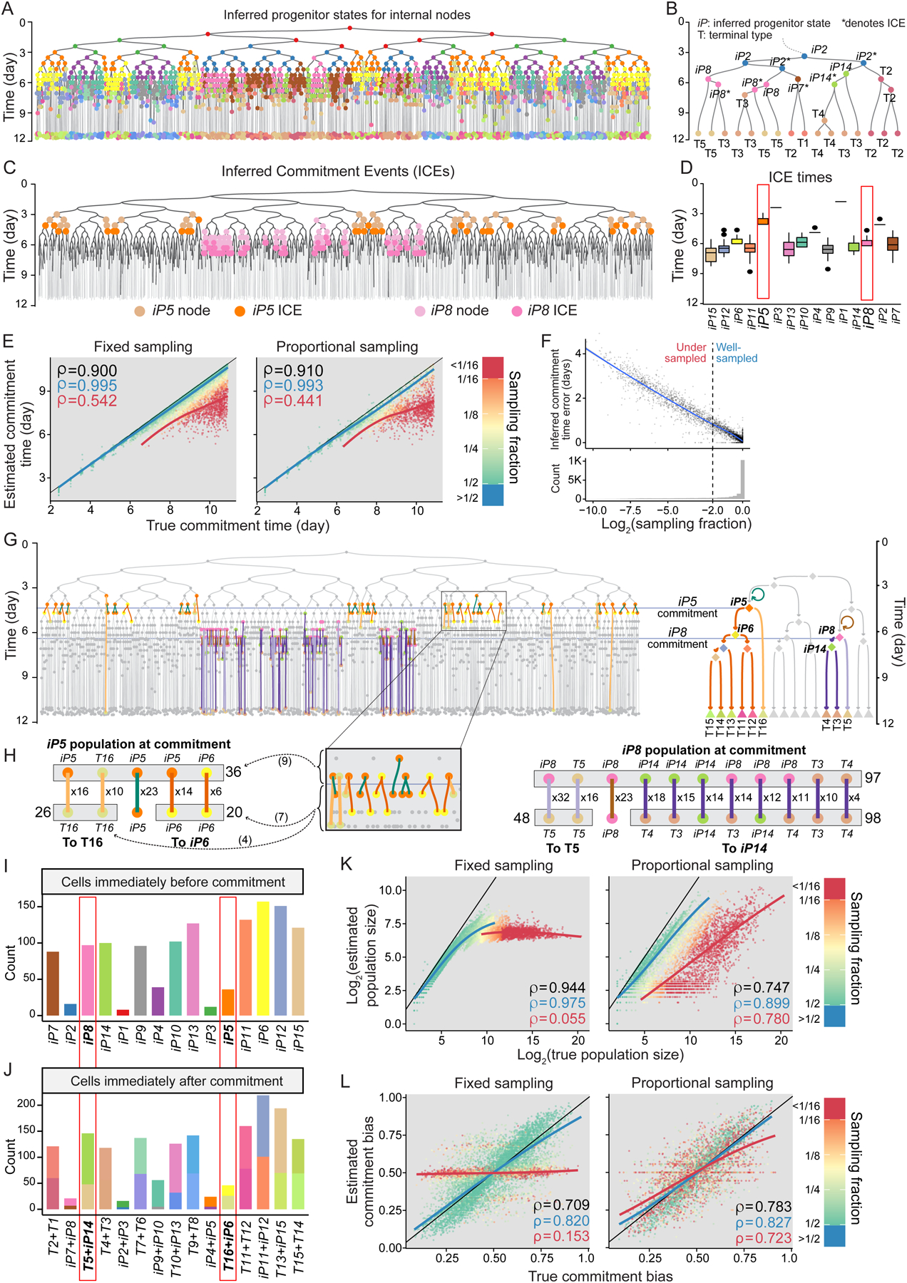
Figure 3. Obtaining progenitor state commitment times, population sizes, and commitment biases from time-scaled phylogeny of sampled cells.

(A) Phylogeny in Figure 2B with internal nodes colored according to their inferred progenitor state. Color key in Figure 2E.
(B) A subtree from A where each internal node is labeled by its inferred progenitor state or terminal type. Asterisks signify ICE nodes.
(C) The tree in A with nodes inferred as iP5 (orange) and iP8 (pink) labeled. Darker shades mark the nodes that are also ICEs.
(D) Boxplots showing the distribution of ICE times for all inferred progenitor states in the tree in A, representing their commitment times. The ICE times for iP5 and iP8 are boxed in red.
(E) Scatterplots showing the correlation between true commitment time of each progenitor state to the value estimated from the phylogenetic tree across all 3,310 simulated phylogenies broken down by sampling strategy. Dot colors represent progenitor states’ sampling fractions based on the key on the right. Blue line and value respectively show trendlines (LOESS) and Spearman’s ρ for progenitors with sampling fraction >= 25%. Those for progenitor states with sampling fraction < 25% are shown in red. Spearman’s ρ for all progenitor states is shown in black. Black lines are y=x.
(F) Scatter plot showing the error of inferred commitment time for progenitor states as a function of their sampling fraction (top) aligned to a histogram of sampling fraction for all progenitor states in the panel (bottom). Error is the absolute value of the difference between estimated and true commitment times. The vertical dashed line shows sampling fraction cutoff of 0.25. Trendline (LOESS) is in blue.
(G) The edges and the nodes relevant to population size and commitment bias of iP5 and iP8 are shown on the tree from A (left) aligned to the corresponding reconstructed fate map (right). Horizontal lines mark iP5 and iP8 commitment times. Edges in the phylogeny are classified and colored based on the commitment they represent, and nodes based on their inferred progenitor state or terminal type, with the fate map serving as the color key. Circular arrows on the fate map indicate divisions without commitment (self-renewal).
(H) Tally of edges and pre- and post-commitment nodes associated with iP5 (left) and iP8 (right) from the phylogeny in G, a part of which is magnified for added clarity. The number next to each edge indicates how many times the combination of incoming and outgoing progenitor state or terminal type was observed. Gray boxes on top indicate the nodes that were counted towards progenitor state population size, gray boxes on the bottom indicate post-commitment nodes counted for commitment bias. The number next to each gray box indicates the total count of nodes in that box. Arrows from G inset show in parenthesis counts being added to relevant tallies from the inset. Color key same as G.
(I) Barplots showing the estimated population size of each inferred progenitor state in A. Red boxes mark iP5 and iP8 estimates from H.
(J) Stacked barplots showing the estimated post-commitment population size of each inferred progenitor state in A, stacked and colored according to the downstream state they lead to. Red boxes mark estimates relevant to iP5 and iP8, colored according to Figure 2E.
(K,L) Scatter plots showing the correlation between true and estimated population size (K) and commitment bias (L) of inferred progenitor states in fixed (left) and proportional sampling (right) across all 3,310 simulated phylogenies. Other plot features identical to panel E.
See also Figure S3.
